Dog Blog Post #288: Today's Daily Shoot was...
Make a photograph of a symbol today.
... which prompted a lively discussion at breakfast today as the family and I tried to decide the difference between symbols, signs, and icons. I don't think they resolved anything, other than, "we know it when we see it," leaving me no more knowing than when the conversation started.
In the end, I grabbed my camera and we set out on a walk down city streets. Feeling a bit ambivalent about the topic, I snapped a picture of the first symbol we came across that was low enough to fit in the frame with one of the dogs. That would be the picture below...
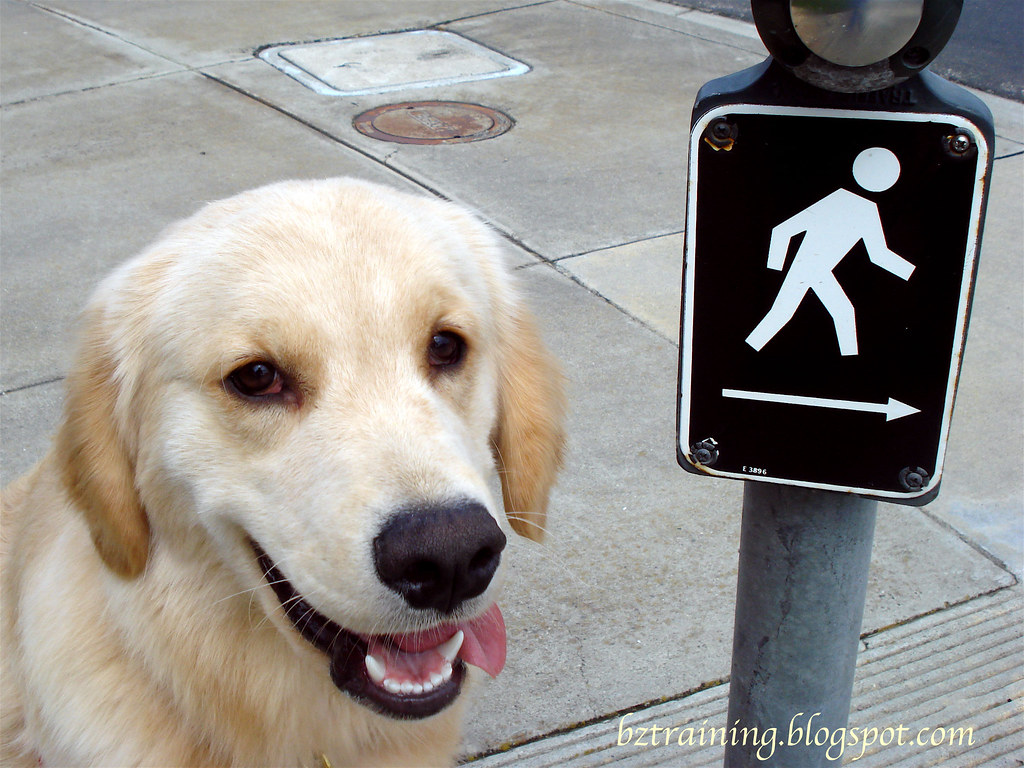
... of a crosswalk symbol with Henry sitting proudly beside. (Zachary was too caught up in the olfactory symbols on the nearby light post to join us.)
That's it.
One picture.
Sure glad it wasn't blurry! :)
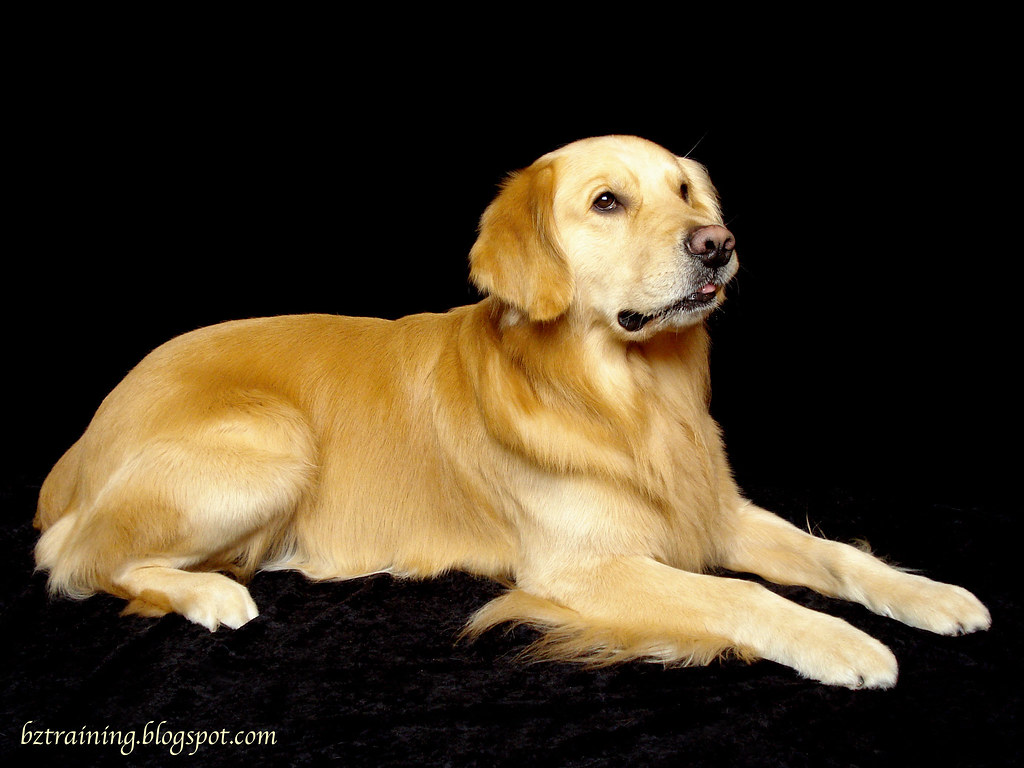
Now on to the question... The picture at the top of the post was taken a few days ago, but it caught my eye again today, and as I spent so little time on the Daily Shoot shot, I decided to play around with it a bit. The version up top has the contrast turned up and the brightness turned down, creating a much blacker background a bit darker dog than the original, which is shown with just modest tweaks below.

My son prefers the one up top, as it appears brighter/clearer/sharper to him. I can see his point, but I'm just not sure when post-processing turns from "invisible improvement" to overblown.
... anyone else have opinions as which is "better"?
Editor's Note #1: In answer to houndstooth's question, all I wanted from Henry was for him to remain seated while being petted by the friendly strangers. This is an AKC CGC (Canine Good Citizen) thing, and while this isn't a CGC class, I will probably try to get his CGC at some point as I did with both Beau and Zachary.
But Henry is a sensitive soul, and I think my reaction to him standing (by backing off, since my "friendly strangers" weren't doing their part by backing off themselves) left him worried and confused.
Poor guy - he loves people, loves meeting them, and I after the 3rd stranger (NONE of which backed off like they were supposed to!) I realized that Henry wasn't happy. So I let him greet the 4th and final stranger - a lovely, gentle girl whose attentions Henry clearly enjoyed. :)
Next week, I'll probably just require him to have all four on the floor, and worry about sitting for strangers during some other class, when the strangers (hopefully) follow directions better!
Editor's Note #2: I occasionally see comments such as "too hard on yourself", and I feel I should point out that I'm neither genuinely upset nor fishing for compliments. It's more in the vein of asking the family if you put too much salt in the mashed potatoes, or wondering if should have served beans instead of peas, or perhaps pointing out the obvious - that you burnt the toast!
Mostly, I'm just thinking out loud and wondering if others think the same way or not! :)
© 2011 BZ Training - All Rights Reserved
6 comments:
I like the top picture of Zachary the best - it has more "pop" I think.
I'm with the Sprollies, the top photo is my choice.
*lightbulb turns on over head* Ahhh! CGC! Now I get it! Perhaps next time you should just be direct and ask the greeters not to pet him if his butt comes off the floor. You could make it into a game at home, where he gets a pet for sitting, possibly. I totally understand the scenario now, though!
As far as the pictures go, I honestly think that's a matter of personal preference. My eye is more drawn to the top one, but then I started noticing that there's a wrinkle in the fabric near his foot, and it makes no sense in the top picture, because you can't see that it's fabric he's laying on. Henry looks good in both of them. Some of it is related to what you want to draw the viewer's eye to, too. If you had a beautiful backdrop or skyline, editing the bottom would draw the eye to Henry and then beyond. If you had him standing and you wanted people to notice his lines and details, the top picture is great for that. Bah! I'm no help! lol
Hmmmmm, as always, the pics are gorgeous. I was originally really drawn to #1, as I thought the colour saturation in the black had just a little more ooompf than the bottom one, but then I noticed the same spot houndstooth did with his foot kind of floating into no where and I started to prefer the bottom shot. Both are great, just for different reasons - I know, I'm not help at all!
I just slightly prefer the bottom photo. It's just a wee bit softer, kinder and more natural looking, to my unsophisticated eyes anyway:)
I guess it depends on what the end purpose of the photo is as to which one you would choose?
I prefer the top one, but I tend to like a more saturated and contrasty photo.
I think post-processing is where part of your style begins to develop and it's all up to you.
As long as your careful not to blow out details in the highlights or lose details in the shadows, you move the post to a point that you are happy with.
I'm amazed at how much your photography has grown with the daily shoot. You've got amazing talent and your creativity is second to none.
And we won't talk about your gorgeous models.
Post a Comment